ShopDreamUp AI ArtDreamUp
Deviation Actions


Suggested Deviants


Suggested Collections


You Might Like…


Featured in Groups


Description
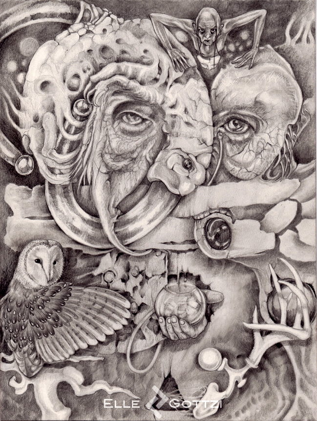
Shaman "came to me" while my immune system was beating me up like no tomorrow .. while i was still refusing taking any meds .. so i was distracting myself with this drawing which took me some many hours / days to finish.. still not sure if i am actually done with it.  (Smile)")
Image size
649x860px 594.25 KB
Make
Canon
Model
Canon MX410 series Network
© 2012 - 2024 ellegottzi
Comments82
Join the community to add your comment. Already a deviant? Log In
<img src="e.deviantart.net/emoticons/w/w…" width="25" height="20" alt="
Your technique is superb, especially considering the diverse textures you've created. That takes a lot of commitment and talent. The textures that stand out to me most are the crackling skin and the highlights you have on the body at the top.
However, the art is lacking a focus point. My eyes tend to wander, first to the left side with the owl, then to the corpse at the top. The elements don't work together to produce an overall effect; rather, they're all fighting for attention. This distracts viewers--they may miss some of your stunning details! Instead, you could draw elements that lead you to the center of the piece.
Your other works are crafted with the same careful hand, but are not as strong as they could be. The lack of contrast and focus point takes away from these works. Actually, I've noticed this in some of your collaborations as well. If you look at the strips Bernard drew and compared it to your own, the shading gets lighter. This lack of contrast makes the art appear weaker.
Use of darker shading would be beneficial.
I hope you found this critique useful. Please tell me if you decide to update any works! Otherwise, I will be watching you for more masterpieces. <img src="e.deviantart.net/emoticons/f/f…" width="33" height="15" alt="